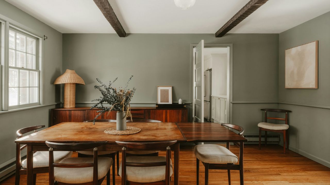
If you want the short answer, the dominant trending colors of 2026 are warm khakis, chocolate and espresso browns, smoky greens, blue-green jade shades, burgundy and mahogany reds, earthy terracottas, buttery yellows, softened pastels, and quiet off-whites.
This is not based on one brand declaring a fashionable shade.
Several major color authorities are pointing in related directions.
Pantone selected Cloud Dancer, an airy white, as its 2026 Color of the Year. Sherwin-Williams chose Universal Khaki. Benjamin Moore selected the espresso-and-charcoal Silhouette AF-655. Behr chose smoky jade Hidden Gem, Valspar chose Warm Eucalyptus, and Glidden selected Warm Mahogany. Dunn-Edwards’ broader 2026 forecast also emphasizes nature-derived colors, including earthy greens, soft blues, warm neutrals, and balanced purples.
Put those selections next to one another and 2026 starts to make sense.
Color is not disappearing.
It is becoming more grounded.
Why 2026 Color Trends Feel Different
For several years, residential interiors were dominated by white, cream, pale beige, and gray.
Those colors have not disappeared. What has changed is the role they play.
The broader color trends 2026 story is less about decorating an entire house in nearly identical neutrals and more about giving neutral rooms depth through brown, olive, jade, rust, burgundy, dusty blue, clay, muted yellow, and other softened colors.
Sherwin-Williams’ 2026 Colormix forecast includes frosted tints, sunbaked hues, restorative darks, and foundational neutrals. Its warm palette specifically includes natural clay, buttery yellow, and enriched reds.
That is a useful clue.
The new palette is not screaming for attention.
It feels collected.
A room might still begin with a neutral wall, but instead of pairing it only with another beige sofa and cream rug, designers are adding olive upholstery, walnut furniture, burgundy textiles, muted blue cabinetry, or deep brown architectural details.
This shift makes the 2026 color trends easier to live with than many short-lived color crazes.
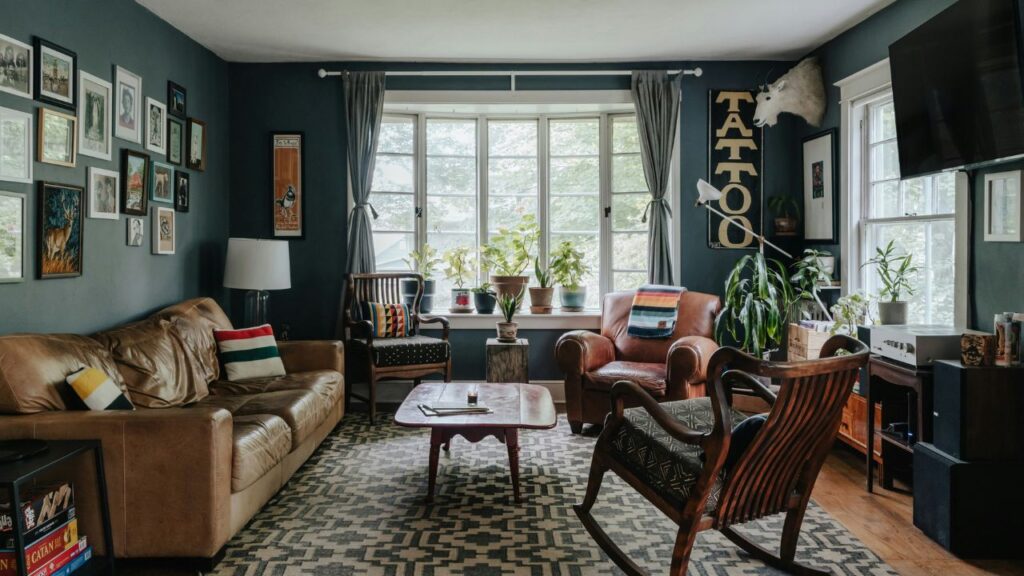
The Biggest Color Trend of 2026: Warmth Without Excess
One word explains much of what is happening: warmth.
Cool gray has lost much of the dominance it once had in residential interiors. In its place, warm neutrals are being used as foundations for rooms that feel softer and less stark.
Sherwin-Williams’ Universal Khaki SW 6150 is a good example. The company describes it as a mid-tone neutral with a slight yellow undertone and selected it as its 2026 Color of the Year.
This does not mean every house should suddenly become tan.
The better lesson is that today’s neutral palette has broadened.
Think:
- khaki;
- mushroom;
- taupe;
- sand;
- putty;
- camel;
- warm greige;
- soft beige;
- stone;
- muted clay.
The best warm neutrals have enough undertone to react beautifully to wood, stone, brass, aged metal, linen, wool, and natural light.
They feel like colors rather than blank backgrounds.
1. Khaki Is Becoming a Serious Interior Neutral
Few shades explain the movement away from cold gray better than khaki color.
Sherwin-Williams chose Universal Khaki SW 6150 as its official 2026 Color of the Year, describing the shade as a warm, adaptable foundation suited to contemporary interiors.
Khaki sits somewhere between beige, tan, olive, and earthy yellow depending on the exact formula.
That complexity is its strength.
Unlike a very pale beige, khaki carries enough visual weight to stand up to substantial materials such as:
- walnut;
- dark oak;
- brown leather;
- black metal;
- travertine;
- aged brass;
- deep green textiles.
Where Khaki Works Best
Try it in:
- living rooms;
- hallways;
- home offices;
- bedrooms;
- cabinetry;
- dining rooms.
For a softer scheme, pair khaki color with warm white, cream, dusty green, and oak.
For something stronger, add oxblood, charcoal, espresso brown, or dark blue.
2. Chocolate Brown Is No Longer Just a Furniture Color
One of the clearest shifts in current interior color trends is the return of brown as an intentional decorating color.
Not beige.
Not greige.
Brown.
Benjamin Moore’s 2026 Color of the Year, Silhouette AF-655, combines espresso brown with charcoal undertones. The brand connects the shade with renewed interest in classic tailoring, rich brown families, and timeless design.
Design coverage for 2026 is pointing in the same direction, with chocolate brown appearing as one of the year’s prominent home color families.
The appeal of chocolate brown is easy to understand once you see it in a room.
It is dark without feeling as sharp as black.
It works beautifully with:
- cream;
- warm white;
- dusty pink;
- muted blue;
- sage;
- burgundy;
- caramel;
- oak;
- brass.
Use it on millwork, cabinetry, interior doors, a study, or a compact powder room if painting an entire living room feels intimidating.
The second advantage of chocolate brown is longevity. Brown already exists naturally in timber, leather, stone, and woven fibers, so introducing it through paint usually feels less trend-dependent than an artificial high-saturation shade.
3. Espresso and Charcoal-Brown Are Replacing Flat Black
Black will always have a place in interiors, but many designers are reaching for dark colors with more visible undertones.
This is where moody colors become interesting.
A black-brown, brown-charcoal, muddy navy, or deep green gives a room darkness without removing all color information.
Benjamin Moore’s Silhouette is a strong 2026 example. Sherwin-Williams’ forecast also contains what the brand calls restorative darks, while Glidden’s Warm Mahogany approaches darkness from the red-brown family.
Try these shades in spaces where intimacy matters:
- dining rooms;
- studies;
- libraries;
- media rooms;
- bedrooms;
- powder rooms.
The trick with moody colors is not to assume dark paint requires a huge room.
A small room can look fantastic in a deep color when the decision is deliberate. What matters more is how you handle ceiling color, trim, lamps, reflective surfaces, textiles, and natural light.
4. Burgundy and Deep Red Are Growing Up
Bright red can be difficult to live with across four walls.
Deep red is another story.
Burgundy red has returned through both fashion and interior design because it carries warmth without the visual intensity of primary red.
It works especially well with the current appetite for dark timber and brown.
Glidden’s 2026 Color of the Year makes this trend particularly clear. Warm Mahogany PPG1060-7 is a grounded red-brown, and the company’s accompanying trend palette includes copper, sandy neutrals, smoky gray-green, deep emerald, and other subdued tones.
A room does not need burgundy walls to participate in the trend.
Use burgundy red through:
- velvet chairs;
- curtains;
- cushions;
- rugs;
- painted joinery;
- dining chairs;
- artwork;
- bedding.
It is particularly good at preventing beige or brown rooms from looking too predictable.
5. Warm Mahogany Is the Red-Brown to Watch
There is a practical reason earthy colors keep appearing across current forecasts.
They connect easily to materials already used in homes.
Clay relates to terracotta.
Brown relates to timber.
Green relates to plants.
Rust relates to metal and earth.
Glidden’s Warm Mahogany sits directly in this family, while Sherwin-Williams’ Sunbaked Hues palette explores natural clay, enriched reds, yellow, rust, and brown-influenced shades.
That makes earthy colors unusually easy to layer.
You do not need a perfect color match.
In fact, a room often looks richer when clay, walnut, tan, rust, cream, and olive are slightly different from one another.
The variation creates depth.
6. Terracotta Is Becoming Softer and More Sophisticated
Traditional terracotta can lean strongly orange.
The 2026 version is more nuanced.
Current terracotta tones often contain pink, brown, red, or dusty clay undertones rather than obvious pumpkin orange.
Sherwin-Williams’ Sunbaked Hues collection includes warm clay-derived shades and colors such as Henna Shade, Pennywise, Peppery, and Armagnac.
These colors work beautifully with limewash-style finishes, natural textiles, ceramic objects, aged timber, woven rugs, and matte walls.
Use terracotta tones in:
- dining spaces;
- kitchens;
- entryways;
- bedrooms;
- garden rooms;
- covered patios.
If you worry that terracotta will date quickly, use it on smaller surfaces and pair it with quiet materials.
A clay-toned chair against warm white plaster can last visually much longer than an entire room filled with trend-specific accessories.
7. Smoky Jade Is One of 2026’s Most Distinctive Greens
Green has been popular for years, but the shade is changing.
The latest trending paint colors are less likely to resemble bright botanical green and more likely to contain gray, blue, brown, or black.
Behr’s Hidden Gem N430-6A is an excellent example.
The company selected the smoky jade shade as its 2026 Color of the Year, describing it as a balanced blend of blue and green designed to feel grounded while still carrying energy.
Smoky jade works particularly well with:
- walnut;
- medium oak;
- warm white;
- aged brass;
- dusty rose;
- camel;
- charcoal;
- cream stone.
One advantage of these trending paint colors is that they are already muted.
That makes them easier to use on a large surface than clearer jewel tones.
8. Sage Green Is Getting Deeper
The pale gray-green that dominated social-media interiors for several years is not disappearing, but sage green is getting earthier.
Valspar’s Warm Eucalyptus 8004-28F illustrates the shift. The 2026 Color of the Year is a grounded green with an LRV of 21, making it considerably deeper than the almost-neutral sages many homeowners used earlier in the decade.
This deeper green works well on walls, but it is particularly strong on:
- cabinets;
- doors;
- built-ins;
- paneling;
- wardrobes;
- kitchen islands.
A lighter sage green can still make sense for a room with limited daylight.
The point is not to chase the darkest possible green. It is to select a shade with enough complexity that it changes subtly as daylight shifts.
9. Blue-Green Is Replacing Straightforward Blue in Some Rooms
One of the strongest families in current home color trends is blue-green.
Behr’s Hidden Gem lands here.
So does Rust-Oleum’s 2026 Color of the Year, Satin Lagoon, which the company describes as a jewel-toned teal. Dunn-Edwards also includes botanical and nature-derived blue-green directions within its 2026 forecast.
Why does blue-green work so well?
Because it can change character according to its surroundings.
Against warm wood, it can appear greener.
Near cool stone or white, its blue side may become clearer.
Rich blue green paint colors work beautifully in:
- bathrooms;
- kitchens;
- studies;
- dining rooms;
- bedrooms;
- entryways.
For a refined palette, combine blue green paint colors with cream, walnut, bronze, and warm gray rather than bright white.
10. Soft Blue Is Becoming Dustier
Not every 2026 palette is dark.
Sherwin-Williams’ Frosted Tints direction includes misty blues and soft lavender-influenced colors, while Dunn-Edwards describes soft blues as part of its nature-led 2026 palette.
The important difference is saturation.
The newer blues feel smoky, watery, misty, or mineral-based.
This makes them much easier to combine with the year’s warmer woods and neutral foundations.
Try dusty blue with:
- mushroom;
- burgundy;
- cream;
- oak;
- chocolate brown;
- sage;
- terracotta.
A blue room does not need nautical styling.
Treat blue as an atmospheric neutral and it becomes surprisingly flexible.
11. Butter Yellow Is the Optimistic Accent of 2026
Among all the popular paint colors appearing now, yellow offers the clearest break from the dominant brown-and-green story.
But the fashionable yellow is not neon.
Think custard, butter, straw, faded gold, wheat, and sun-warmed cream.
Sherwin-Williams specifically identifies buttery yellow within its Sunbaked Hues forecast. Current home-decor coverage also points to butter yellow among the earthy, muted shades appearing in 2026 interiors.
Butter yellow is useful because it adds warmth without becoming beige.
Use it in:
- breakfast rooms;
- kitchens;
- small bedrooms;
- painted furniture;
- lamps;
- cushions;
- artwork;
- pantry cabinetry.
A restrained dose of butter yellow can also wake up an otherwise serious palette of walnut, chocolate brown, ivory, and olive.
12. Soft White Is Back—but Not as a Default
Pantone’s selection of Cloud Dancer is one of the most interesting parts of the color trends 2026 story.
PANTONE 11-4201 Cloud Dancer is an airy white chosen as the organization’s Color of the Year for 2026. Pantone positions it as a flexible structural color capable of supporting stronger colors and quieter monochromatic palettes.
This does not signal a return to blank white rooms.
Instead, soft white paint is being treated as an intentional color.
Pair it with:
- textured plaster;
- warm timber;
- red-brown;
- khaki;
- jade;
- burgundy;
- dusty pastels.
The second strength of soft white paint is contrast.
When richer shades are trending, white becomes more useful because it gives them breathing room.
Cloud Dancer makes much more sense beside mahogany or smoky green than it does in an entirely white room with no texture.
13. Powdery Pastels Are Softer Than Candy Colors
Pastels are part of the 2026 color trends, but they are not the sugary nursery colors many people picture.
Pantone’s Cloud Dancer palettes include powdered pastels, while Sherwin-Williams’ Colormix direction includes what it calls frosted tints and sensational pastels.
Think:
- misty lavender;
- dusty pink;
- pale blue;
- chalky peach;
- faded yellow;
- muted mint.
These colors work best when paired with something grounding.
A powder-blue wall with chocolate furniture feels sophisticated.
A pale pink with burgundy or dark walnut becomes more architectural.
Pastels become much easier to use when you stop styling them exclusively with white.
What the Major 2026 Colors of the Year Tell Us
Looking at brand announcements together is more useful than following any single company.
| Brand / Authority | 2026 Selection | Color Family | What It Signals |
|---|---|---|---|
| Pantone | Cloud Dancer | Airy white | Quiet, flexible foundations |
| Sherwin-Williams | Universal Khaki | Warm neutral | Earthier neutral interiors |
| Benjamin Moore | Silhouette AF-655 | Espresso/charcoal | Rich brown-based darks |
| Behr | Hidden Gem | Smoky jade | Complex blue-green |
| Valspar | Warm Eucalyptus | Grounded green | Restorative botanical colors |
| Glidden | Warm Mahogany | Red-brown | Deep, warm statement colors |
| Rust-Oleum | Satin Lagoon | Teal | Jewel-toned blue-green |
| Dunn-Edwards | 2026 trend collection | Nature-derived mix | Soft blues, greens and nuanced neutrals |
These are separate forecasting programs, so they should not be interpreted as a scientific vote on one universal shade.
What matters is the overlap.
Warmth, nature, complexity, softness, and depth appear repeatedly across the forecasts.
The Real 2026 Palette: A Modern Color System
A useful modern color palette for 2026 does not need all the fashionable colors at once.
Five colors are enough.
Example Palette 1: Warm Modern
- Cloud white
- Universal khaki
- Walnut brown
- Deep burgundy
- Soft butter yellow
Example Palette 2: Nature-Inspired
- Warm white
- Eucalyptus green
- Smoky jade
- Clay
- Dark brown
Example Palette 3: Quiet Luxury
- Cream
- Espresso
- Dusty blue
- Oxblood
- Soft gold
Example Palette 4: Relaxed Contemporary
- Off-white
- Mushroom
- Sage
- Terracotta
- Powder blue
A good modern color palette usually has a hierarchy.
One shade should dominate.
One or two should support.
The strongest color should appear in smaller, intentional doses unless the room is designed around it.
Trending Colors by Room
Color trends are much more useful when translated into actual spaces.
A shade that looks excellent in a restaurant or fashion collection may be a poor fit for your bedroom.
Here is a room-by-room framework.
Best Colors for a Living Room in 2026
The best colors for living room spaces need to work across daylight, evening lighting, upholstery, flooring, wood tones, and large furniture.
That is why adaptable shades are often safer than very bright colors.
Strong 2026 choices include:
- warm khaki;
- mushroom;
- eucalyptus;
- smoky jade;
- soft white;
- dusty blue;
- muted terracotta.
If your living room already contains beige furniture, do not automatically choose another beige wall.
Try an olive-green, muted blue, or brown-influenced neutral to create separation.
Another approach to the best colors for living room schemes is keeping the walls quiet while placing deeper colors on upholstery.
For example:
Walls: warm white
Sofa: tobacco brown
Chair: jade green
Curtains: oatmeal
Accent: burgundy
You get the 2026 color story without repainting every year.
Bedroom Color Trends for 2026
Current bedroom color trends favor comfort over stimulation.
That makes soft green, smoky blue, warm neutral, muted brown, off-white, and dusty lavender particularly useful.
Valspar’s choice of Warm Eucalyptus reflects the broader interest in restorative greens, while Pantone’s Cloud Dancer represents the quieter end of the spectrum.
For a cocooning bedroom, try:
- espresso wall;
- ivory bedding;
- oak or walnut furniture;
- soft brass lamps.
For a lighter bedroom:
- warm white wall;
- sage headboard;
- cream curtains;
- dusty blue throw.
The strongest bedroom color trends are not about making sleeping spaces visually busy.
They are about adding enough pigment that the room feels intentional.
Kitchen Color Trends for 2026
White kitchens are not disappearing, but kitchen color trends are expanding well beyond white shaker cabinetry.
Look for:
- smoky green;
- olive;
- mahogany;
- burgundy;
- dark brown;
- warm taupe;
- blue-green;
- natural timber.
Behr’s Hidden Gem demonstrates how blue-green can work on cabinetry and architectural surfaces, while Sherwin-Williams’ 2026 forecast includes rich reds, greens, and complex neutrals suited to broader design use.
If replacing cabinets is unrealistic, use the kitchen color trends in smaller ways:
- paint the island;
- repaint the pantry;
- add colored counter stools;
- introduce a patterned runner;
- use painted open shelving
- add colored ceramics.
Color does not require a full renovation.
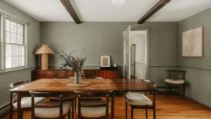
Dining Room Colors
Dining rooms can handle stronger color than many homeowners expect.
This is an ideal place for:
- burgundy;
- mahogany
- chocolate;
- jade;
- charcoal-brown;
- deep teal.
Dark colors become particularly effective at night when table lamps, sconces, and candles create smaller pools of light.
A dining room is also an excellent place to experiment because it is not occupied continuously throughout the day.
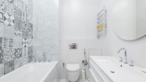
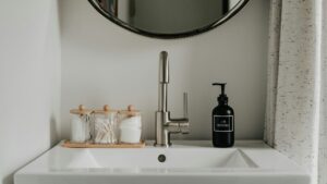
Bathroom Colors
Bathrooms offer a low-risk place for paint color ideas that might feel too bold elsewhere.
Consider:
- smoky jade;
- dusty blue;
- burgundy;
- mushroom;
- terracotta;
- eucalyptus.
A compact powder room can also handle deep brown surprisingly well.
The best paint color ideas for bathrooms account for tile, countertop, metal finish, and artificial lighting.
If the room contains cool gray marble, a yellow-heavy beige may clash.
If the room contains cream stone and brass, a cold blue-white can feel disconnected.
Home Office Colors
Home offices need enough visual character to feel separate from the rest of the house.
Good choices include:
- khaki;
- olive;
- smoky green;
- dark blue;
- soft clay;
- espresso.
Valspar demonstrates Warm Eucalyptus in home-office applications, while Sherwin-Williams’ 2026 palettes include greens, reds, and foundational neutrals intended for contemporary design.
If video calls are part of your routine, also consider how the wall color appears behind you under artificial lighting.
Are Gray Walls Completely Out?
No.
This is where trend articles often become misleading.
A color does not suddenly become unusable because another color becomes fashionable.
The change is more specific:
Cool, flat gray is no longer carrying the entire neutral category.
Gray now works better when it has an obvious relationship with another hue.
Consider:
- green-gray;
- brown-gray;
- blue-gray;
- mushroom gray;
- warm charcoal.
The gray is still there.
It simply has more character.
Are White Walls Out of Style?
Also no.
Pantone literally selected a white—Cloud Dancer—as its 2026 Color of the Year.
What is changing is the all-white formula.
White walls, white sofa, white rug, white curtains, and pale oak can start to feel visually thin if everything has approximately the same value.
A better 2026 approach is:
White + dark brown + muted green + natural wood
or:
White + burgundy + khaki + brass
White becomes the space around the color instead of the entire story.
How to Use Trending Colors Without Dating Your Home
This is probably the most important part of the guide.
A trend should inspire your choices, not control them.
The safest strategy is to divide your home into three layers.
Layer 1: Expensive and Permanent
Keep major structural items relatively enduring:
- flooring;
- stone;
- large cabinetry;
- expensive sofas;
- major built-ins.
Layer 2: Medium-Term
Use stronger color on:
- paint;
- curtains;
- rugs;
- occasional furniture;
- headboards;
- smaller cabinetry.
Layer 3: Easy to Change
Experiment freely with:
- cushions;
- throws;
- artwork;
- lamps;
- ceramics;
- bedding;
- towels.
This lets you enjoy home color trends without turning your entire renovation into a time capsule.
Color Drenching Is Still Relevant—but It Is Becoming More Nuanced
Color drenching means extending one color across multiple architectural surfaces rather than stopping at the wall.
Walls, trim, doors, shelving, and sometimes ceilings can all participate.
Behr presents Hidden Gem in immersive room applications, while Sherwin-Williams showcases saturated uses of colors such as Rojo Marrón and Henna Shade in its 2026 forecast material.
The current version of color drenching does not always require exactly the same paint finish everywhere.
You might use:
- matte walls;
- satin trim;
- semi-gloss cabinetry;
all within one color family.
The slight finish differences allow light to create architectural contrast.
Why Lighting Changes Every Paint Color
Never choose wall paint from a phone screen alone.
Color changes according to:
- daylight direction;
- window size;
- time of day;
- artificial lamp temperature;
- floor color;
- furniture;
- paint sheen;
- surrounding colors.
Valspar, for example, publishes Light Reflective Value information for its paint shades. Warm Eucalyptus has an LRV of 21. The brand defines LRV as a measure of visible and usable light reflected from or absorbed by a painted surface on a scale running from black/zero toward white/100.
This helps explain why the same shade can look dramatically different in two houses.
Always test before buying several gallons.
A Better Way to Sample Trending Paint Colors
Use this process for popular paint colors instead of painting tiny two-inch squares.
Step 1: Choose Three Candidates
More than five often creates decision fatigue.
Step 2: Use Large Samples
A small chip does not show enough color interaction.
Step 3: View Them on Different Walls
A color beside a sunny window may look different on the wall opposite it.
Step 4: Check Morning, Afternoon, and Night
Artificial light can reveal undertones you did not notice in daylight.
Step 5: Put Materials Beside the Sample
Hold flooring, fabric, stone, wood, and curtain samples next to it.
Step 6: Remove the Losing Colors
Comparing twelve near-identical beiges rarely improves the decision.
This method is far more dependable than choosing popular paint colors because they looked good in somebody else’s photograph.
Warm Versus Cool Undertones
Undertone mistakes cause many disappointing paint choices.
A neutral may appear beige at first glance but carry:
- pink;
- yellow;
- green;
- gray;
- peach;
- violet.
A white may lean:
- blue;
- cream;
- gray;
- green;
- pink.
This becomes obvious when two almost-identical colors sit side by side.
Your goal is not to eliminate undertones.
It is to choose undertones that relate to the materials already in the room.
How to Pair the Biggest Trending Colors
Here are practical combinations.
| Main Color | Pair With | Accent |
|---|---|---|
| Khaki | Cream + walnut | Burgundy |
| Chocolate brown | Soft white + oak | Powder blue |
| Smoky jade | Warm white + walnut | Brass |
| Eucalyptus | Sand + cream | Dark brown |
| Burgundy | Mushroom + ivory | Blue-gray |
| Terracotta | Cream + oak | Olive |
| Butter yellow | Warm white + walnut | Green |
| Dusty blue | Mushroom + cream | Oxblood |
| Soft white | Khaki + brown | Jade |
| Mahogany | Oatmeal + warm white | Muted teal |
This is where the current trending colors become genuinely useful: not as isolated swatches, but as relationships.
The 60-30-10 Rule—And When to Ignore It
A common decorating guideline assigns:
- 60% to a dominant color;
- 30% to a secondary color;
- 10% to an accent.
It can help beginners structure a room.
But it is not a law.
A sophisticated neutral room may use five related browns without a clear 60-30-10 division.
A dramatic study may use dark green across 80% of the room.
Use proportion as a tool, not a formula you are afraid to break.
How to Build a Timeless Palette From Current Trends
The phrase timeless paint colors sounds contradictory because paint preferences change.
Still, some colors age better because they relate closely to materials found in architecture and nature.
Examples include:
- warm white;
- stone;
- muted green;
- navy;
- oxblood;
- brown;
- clay;
- mushroom.
The safest way to identify timeless paint colors is to ask whether you would still like the shade if Instagram stopped showing it tomorrow.
If the answer is yes, you are choosing based on taste rather than trend anxiety.
Trendy Versus Timeless: A Simple Test
Ask five questions.
- Does this color work with my flooring?
- Does it work with furniture I already own?
- Does it look good in both daylight and artificial light?
- Would I still like it if the trend disappeared?
- Can I imagine changing accessories without repainting?
If you answer yes to most of them, the color has a good chance of working long term.
A Real-World Color Case Study
Imagine a living room with:
- medium oak flooring;
- beige sofa;
- white ceiling;
- black TV;
- warm daylight.
The owner wants the room to feel current but does not want a dramatic renovation.
Option A: Trend Overload
Paint the walls burgundy.
Buy a green sofa.
Add yellow chairs.
Use terracotta curtains.
Buy a blue rug.
Every fashionable shade appears, yet the room lacks hierarchy.
Option B: Trend-Informed
Paint the walls warm khaki.
Keep the beige sofa.
Add two deep jade cushions.
Use one burgundy chair.
Bring in walnut side tables.
Add a warm white rug.
Now the room reflects current trends without feeling designed around a trend report.
That distinction matters.
Color Trends for Small Rooms
Small rooms do not always need pale paint.
That rule is too simplistic.
A small powder room can look memorable in mahogany.
A compact study can look sophisticated in chocolate.
A small bedroom can work beautifully in eucalyptus.
Pale paint reflects more light, but visual spaciousness depends on much more than brightness.
Contrast, furniture scale, clutter, ceiling treatment, curtains, and lighting all matter.
Colors for Rooms With Low Natural Light
In a naturally dark room, trying to force brightness with cold white paint can sometimes produce a dull gray appearance.
Consider leaning into the conditions with:
- mushroom;
- ochre;
- warm khaki;
- cocoa;
- olive;
- smoky blue;
- burgundy.
If you prefer a lighter room, test warm off-whites and pale earth colors rather than assuming the brightest white will perform best.
Colors for Bright South- or West-Facing Rooms
Strong natural light can tolerate deeper pigment.
Consider:
- jade;
- olive;
- khaki;
- brown;
- terracotta;
- deep blue-green.
In very sunny rooms, bright colors may become more intense than expected, so sampling becomes even more important.
Why Wood Tone Matters to Paint Color
One of the biggest reasons interior color trends are moving warmer is the renewed visual importance of wood.
Current 2026 home-decor coverage points toward warm woods and darker stains alongside muted colors, rather than the highly washed-out pale interiors of previous years
Wood already contributes color.
Oak may read yellow, honey, brown, beige, or gray.
Walnut contributes deeper red-brown and chocolate tones.
Cherry may contain red.
That means paint cannot be selected in isolation.
The Return of Red and Gold
Sherwin-Williams’ forecast includes retro-inspired reds and golds alongside modern neutrals and darks.
This does not mean recreating a 1990s burgundy-and-gold living room.
The newer treatment is more restrained.
Picture:
- cream plaster;
- walnut furniture;
- one oxblood chair;
- aged brass lamp;
- faded red rug.
The materials do more work than the color itself.
Why Nature-Inspired Colors Keep Returning
Green, brown, clay, sand, sky blue, and botanical shades are not new inventions.
That is exactly why they are useful.
Valspar frames Warm Eucalyptus around restorative, nature-linked design. Behr connects Hidden Gem with grounded blue-green. Dunn-Edwards says its 2026 collection draws inspiration from colors found in nature.
This repeated direction helps explain why current palettes can feel contemporary without looking artificial.
Color Trends Beyond Paint
The trending paint colors story also affects materials.
Look for similar tones in:
- upholstery;
- rugs;
- bedding;
- stone;
- tile;
- cabinetry;
- furniture finishes;
- curtains;
- decorative glass;
- ceramics.
Sherwin-Williams’ industrial wood forecast, for instance, translates its broader 2026 directions into frosted tints, sunbaked hues, restorative darks, and foundational neutrals for wood finishes.
This is why the 2026 color trends can appear in a home even when the walls stay white.
How to Use Color Trends on a Budge
You do not need a renovation.
Try this order:
Under $50
- cushion covers;
- small artwork;
- towels;
- ceramic pots;
- candles;
- lampshades.
Under $200
- throw;
- bedding;
- small rug;
- side table;
- painted stool;
- mirror frame.
Bigger Change
- paint;
- curtains;
- accent chair;
- cabinetry;
- large rug.
Start small with unfamiliar colors.
If you still love the shade after living with it for several months, expand it.
Which Color Trends Will Probably Last Longest?
No forecast can guarantee longevity.
Still, some current directions have qualities associated with greater versatility.
The strongest candidates are:
Warm Brown
It relates naturally to timber and leather.
Muted Green
It has remained useful across traditional, modern, rustic, and contemporary interiors.
Warm Off-White
It works as a background across many styles.
Khaki
It sits close to established neutral families.
Burgundy
It has historical precedent in interiors and fashion.
Dusty Blue
It is subdued enough to function almost like a neutral.
That makes these safer long-term choices than highly specific novelty shades.
Which 2026 Colors Are Better as Accents?
Some colors may be easier to enjoy in smaller doses.
These include:
- butter yellow;
- bright rust;
- saturated teal;
- lavender;
- strong red.
This does not mean they are poor choices for walls.
It simply means homeowners who are uncertain about bold color may find them easier to introduce through textiles and furniture first.
Color Psychology: Use It Carefully
You will often see claims such as “blue makes everyone calm” or “yellow automatically improves happiness.”
Real reactions to color are more complicated.
Culture, memory, lighting, context, material, saturation, and personal taste influence how a room feels.
Instead of asking which color universally produces a specific emotion, ask:
How does this exact shade make me feel in this exact room?
That is a far more useful decorating question.
The Biggest Mistakes People Make With Trending Colors
Mistake 1: Copying a Photo Exactly
Your room has different light, flooring, proportions, and furniture.
Use inspiration photos as direction rather than instructions.
Mistake 2: Choosing by Name
“Warm beige” from one brand may look very different from another.
Use the actual sample.
Mistake 3: Ignoring Undertones
This is how cream walls suddenly look yellow beside a cool-white sofa.
Mistake 4: Using Every Trend at Once
Good rooms need editing.
Mistake 5: Painting Before Choosing Major Materials
If you are replacing flooring, countertops, or upholstery, choose those first.
Paint offers far more flexibility.
Mistake 6: Assuming Dark Paint Makes Every Room Smaller
Dark colors can create visual depth and atmosphere when used intentionally.
Mistake 7: Choosing From a Screen
Digital color is useful for narrowing choices, not final approval.
Mistake 8: Forgetting the Ceiling
The ceiling is another visual surface.
Bright white is not the only option.
Mistake 9: Following Trend Forecasts Blindly
Trend forecasting explains market direction.
It does not know your house.
Mistake 10: Forgetting Personal Taste
If you dislike brown, Benjamin Moore choosing a brown-based color does not mean you need brown walls.
Trending Color Checklist Before Painting
Use this checklist before committing:
- I have seen a real sample.
- I tested it in the actual room.
- I checked the color in morning light.
- I checked it at night.
- I compared it with flooring.
- I compared it with furniture.
- I checked the undertone.
- I considered trim color.
- I considered the ceiling.
- I know which paint sheen I want.
- I like the color beyond its trend status.
- It works with nearby rooms.
- I know which existing items will stay.
- I am not choosing purely from an online photograph.
Frequently Asked Questions
What colors are trending in 2026?
The strongest 2026 color trends include warm khaki, espresso and chocolate brown, burgundy and mahogany red, smoky jade, eucalyptus green, blue-green, muted terracotta, butter yellow, powdered pastels, dusty blue, and soft white. Major 2026 selections from Pantone, Sherwin-Williams, Benjamin Moore, Behr, Valspar, and Glidden support this broader move toward grounded, warm, nuanced color.
What is Pantone’s Color of the Year for 2026?
Pantone’s 2026 Color of the Year is PANTONE 11-4201 Cloud Dancer, an airy white positioned as a flexible structural shade for both quiet palettes and stronger color combinations.
What is Sherwin-Williams’ 2026 Color of the Year?
Sherwin-Williams selected Universal Khaki SW 6150, a warm mid-tone neutral with a slight yellow undertone.
What is Benjamin Moore’s 2026 Color of the Year?
Benjamin Moore selected Silhouette AF-655, a rich combination of espresso-brown and charcoal influences.
What is Behr’s Color of the Year 2026?
Behr selected Hidden Gem N430-6A, a smoky jade blending blue and green.
What is Valspar’s 2026 Color of the Year?
Valspar selected Warm Eucalyptus 8004-28F, a grounded green tied to restorative and nature-inspired interiors.
What is Glidden’s Color of the Year 2026?
Glidden selected Warm Mahogany PPG1060-7, a deep red-brown designed as a grounded statement color.
Is beige still popular in 2026?
Yes, but beige is changing.
The strongest versions are richer and earthier, including khaki, mushroom, taupe, stone, camel, and other complex neutral shades. Sherwin-Williams’ Universal Khaki is one of the clearest examples.
Is gray paint out of style?
Gray is still usable, but warmer or more complex gray-based colors fit current direction better than flat cool gray.
Look at mushroom, charcoal-brown, green-gray, and blue-gray.
Is green still trending in 2026?
Yes.
Green remains significant, particularly eucalyptus, smoky jade, olive, and muted botanical shades. Valspar and Behr both selected green-family shades for 2026.
Is brown trending in 2026?
Yes.
Chocolate brown, espresso, walnut, mahogany, and other warm brown families are prominent. Benjamin Moore’s Silhouette gives the brown trend a major official endorsement for 2026.
Is burgundy still trending?
Deep red and red-brown shades remain part of the current palette. Glidden’s Warm Mahogany and Sherwin-Williams’ enriched-red forecast both point in this direction.
What wall colors make a home look modern in 2026?
Try warm khaki, smoky jade, muted green, mushroom, dusty blue, warm white, chocolate brown, or clay.
The right choice depends on the room’s materials and light rather than the year alone.
What is the most popular neutral color in 2026?
There is no single universal winner, but khaki, mushroom, warm beige, taupe, soft white, and brown-based neutrals are strong directions. Sherwin-Williams’ choice of Universal Khaki captures that movement particularly well.
What colors go with khaki?
Khaki works well with cream, warm white, walnut, olive, burgundy, charcoal, dusty blue, brass, and black.
What colors go with chocolate brown?
Try cream, powder blue, dusty pink, warm white, sage, jade, burgundy, camel, or muted yellow.
What colors go with sage green?
Sage green pairs easily with warm white, beige, brown, terracotta, dusty pink, oak, brass, and muted blue.
What colors go with butter yellow?
Pair it with warm white, chocolate brown, sage, walnut, dusty blue, burgundy, or cream.
What are the latest living room color trends?
Current best colors for living room schemes include khaki, mushroom, smoky green, dusty blue, warm white, terracotta, and deeper brown accents.
What are the latest kitchen paint colors?
Current kitchen color trends include smoky jade, olive, blue-green, deep brown, burgundy, warm taupe, and natural wood tones.
What are the latest bedroom paint colors?
Current bedroom color trends favor quieter shades such as eucalyptus, warm white, dusty blue, muted brown, mushroom, and soft lavender.
Is color drenching still popular?
Yes, immersive use of one color family remains relevant. Current brand imagery and forecasts continue to show walls, trim, cabinetry, and architectural details treated with closely related or matching colors.
What colors should I avoid if I want a timeless house?
There is no universal blacklist.
Instead of avoiding specific shades, be careful with colors you only like because they are suddenly fashionable.
Use highly trend-specific shades on easily changed surfaces if you are uncertain.
Final Design Perspective
The most important thing about the color trends 2026 is not one winning shade.
It is the change in attitude toward color.
Neutral does not automatically mean pale.
Modern does not automatically mean gray.
Luxury does not automatically mean beige.
Dark does not automatically mean black.
Green does not need to look obviously botanical.
Red does not need to be bright.
White does not need to be sterile.
The most convincing paint color ideas now combine warmth, complexity, texture, and personal preference.
Start with your fixed materials.
Look at the flooring.
Look at the stone.
Look at your furniture.
Understand the daylight.
Then decide which current colors improve what is already there.
That may be Universal Khaki.
It might be smoky jade.
It could be eucalyptus, chocolate, burgundy, dusty blue, terracotta, butter yellow, or a quiet Cloud Dancer-style white.
Trend reports are most useful when they expand your options.
They should not narrow them.
The smartest interpretation of home color trends is therefore simple: borrow the ideas that feel natural in your home, ignore the ones that do not, and use fashionable color in a way that still looks like you after the trend cycle moves on.